
Are Small Cap Stocks Dead?
How Falling Small Cap Quality and a Winner-Take-Most Economy Broke the Small Cap Premium

A nearly century-long pattern linking firm size and long-run returns broke down in the mid-to-late 2000s. This piece explains what changed and why it matters.
When I teach Finance Theory, I often begin with a simple thought experiment that illustrates a timeless lesson about risk and return. I ask students to imagine they have $100 to invest today on behalf of their great‑grandchildren 80 years from now. The question is straightforward: What asset would you choose?
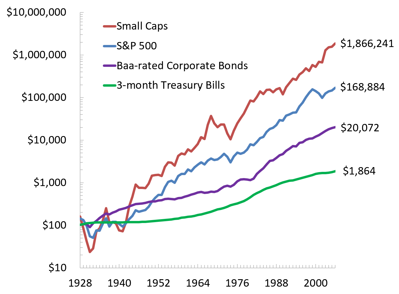
To anchor the discussion, I show students how $100 invested in 1928 would have grown by 2006 across several major asset classes (Figure 1). Small cap stocks dominate the comparison.1 They turn $100 into nearly $2 million, while large caps, corporate bonds, and Treasury bills generate far smaller sums. The implication seems obvious: over long horizons, small caps outperform, so long‑term investors should favor them.
Next, we compute the average annual return and volatility for each asset class. When plotted in risk and return space (Figure 2), the pattern becomes even clearer. From 1928 to 2006, higher risk was consistently associated with higher return.
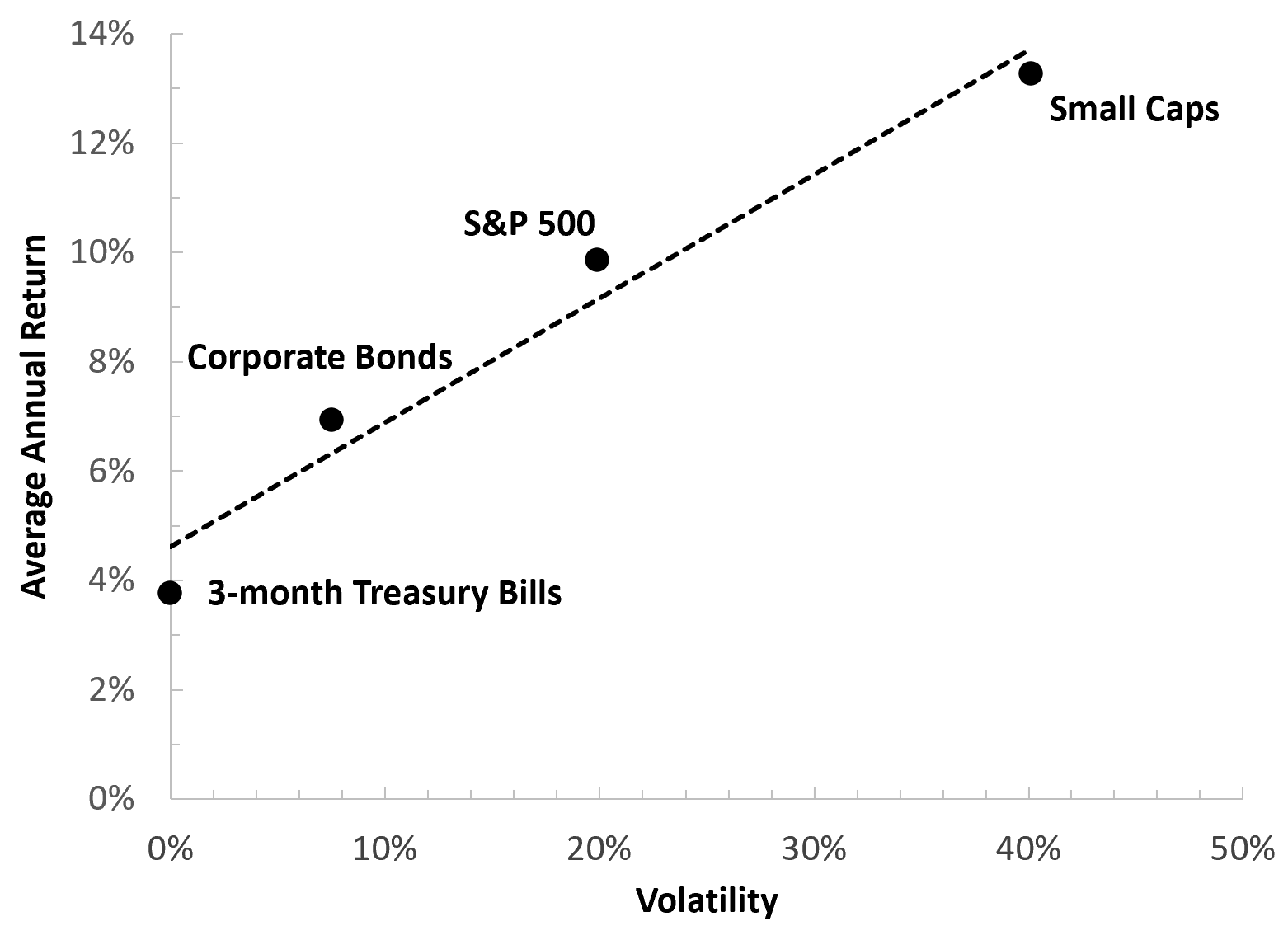
The historical relationship between risk and return depicted in Figure 2 is strikingly linear, with each asset class offering investors roughly the same amount of reward per unit of risk.2 If your investment horizon is multiple decades, the lesson is clear. You should hold a diversified portfolio of the riskiest asset class you can tolerate, because in the long run this approach produces the highest average return. Historically, that meant investing in small cap stocks.
When I taught this material in earlier years, this is where the analysis ended, and so the class proceeded under what seemed like a reasonable assumption: the beautifully linear relationship between risk and return across diversified portfolios of various asset classes would continue indefinitely.
Why question it? For nearly eight decades, it looked like a law of nature.
Only now, with nearly two decades of additional data, is the flaw in that argument obvious. The tidy historical relationship between risk and return did not simply weaken in recent years. It broke.
The Modern Era: A Broken Relationship
To understand this break, it is helpful to look more closely at how small cap stocks behaved in earlier decades. Figures 3 and 4 plot the annual returns for small caps and the S&P 500 across two nearly equal length periods.
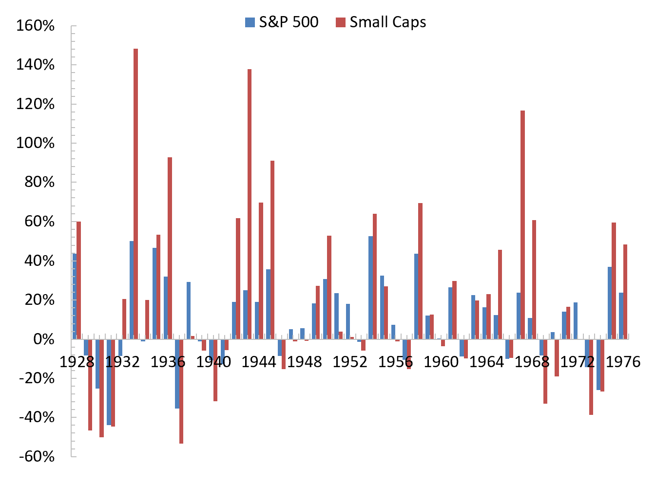
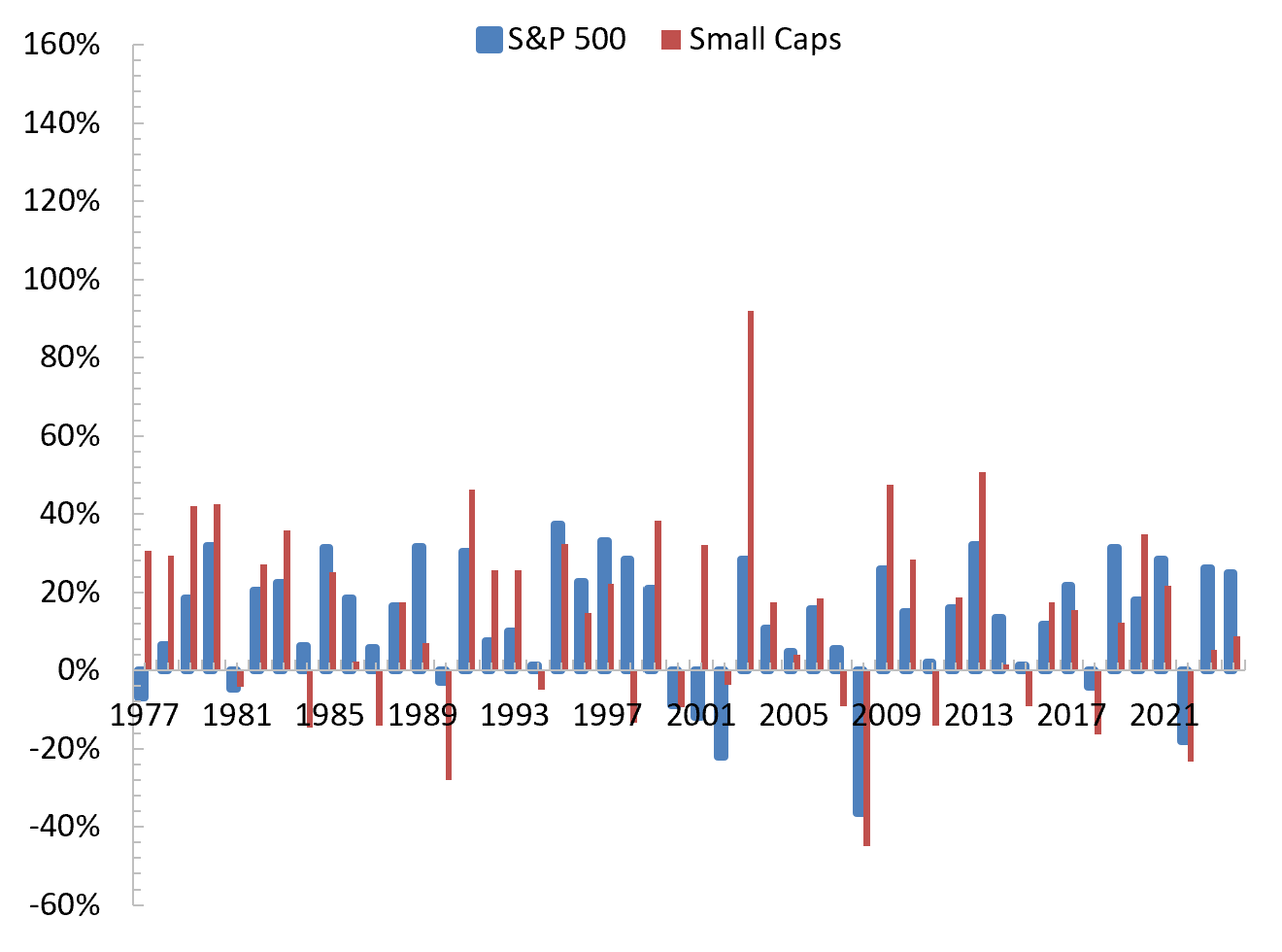
Figure 3 shows annual returns from 1928 through 1976. Small caps frequently delivered extraordinarily large gains during this era, returning more than 50 percent in fourteen different years, and exceeding 100 percent in three of those years. These explosive upside years help explain why small caps compounded so dramatically over the long run. Despite substantial volatility, the right tail of annual returns was exceptionally long.
Figure 4 covers 1977 through 2024 using the exact same vertical scale. The pattern is strikingly different. Across almost fifty years, there are only two instances of small caps returning 50 percent or more. This suggests that in recent decades small caps have benefited far less from the extreme right tail events that historically compensated investors for bearing their higher degree of risk.
What is perhaps most surprising given this data is that the average return on small caps from 1977 through 2024, at 11.5 percent, is nearly identical to the average return from 1928 through 1976. The disappearance of huge “home run” years is not the primary reason for the more recent underperformance.
In fact, between 1977 and 2006, a period with just a single year in which returns exceeded 50 percent, small caps compounded at an astonishing rate of nearly 15.5 percent per year. At this clip, investors’ money was doubling roughly every 4.5 years!
In contrast, between 2007 and 2024, small caps returned just 5.1 percent per year versus 10.3 percent for the S&P 500.3 The long‑standing historical pattern of small cap outperformance did not fade gradually. It broke sharply in the post‑2006 environment.
Is This Nearly Two Decade-Long Period Unique?
Given the dramatic deterioration in small cap performance since 2007, a natural question is whether this nearly two-decade period is unusual in a historical context. After all, markets are cyclical. Perhaps small caps are simply in a prolonged dry spell and will eventually mean revert.
Figure 5 offers useful perspective by plotting the 20-year rolling average small cap premium relative to the S&P 500 from 1928 through 2024.
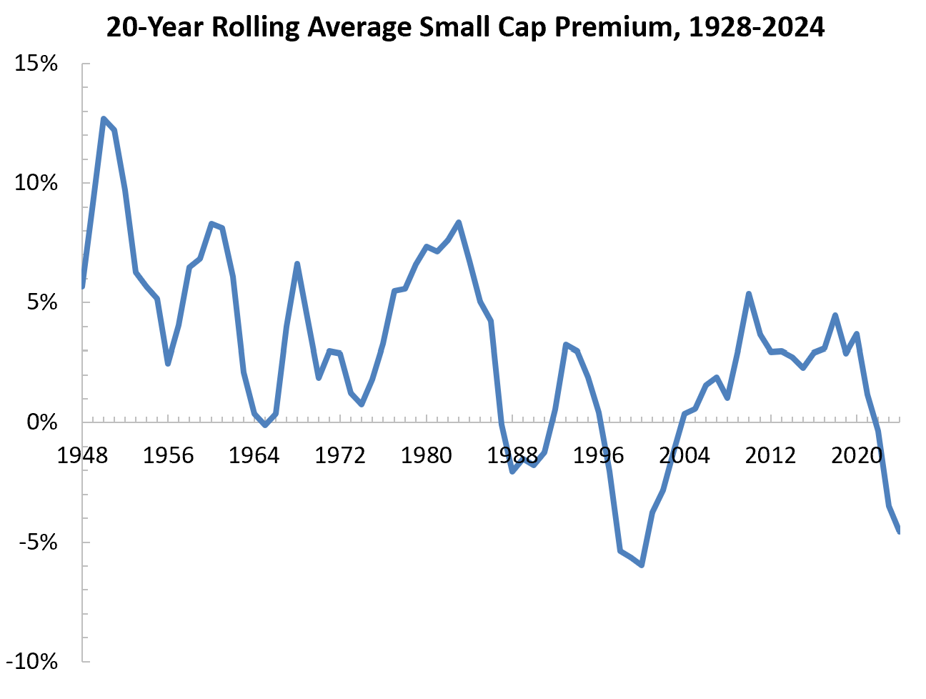
Importantly, since Figure 5 plots 20-year rolling averages, short-run fluctuations are muted. This makes the magnitude of the post-2006 decline (and the decline of the late-1990s) even more striking.
Several features of the historical record stand out:
Extended periods of small cap underperformance are not unprecedented. The premium fell sharply in the mid-1960s, again in the late 1980s, and moved sharply negative in the late-1990s.
Although the small cap premium has fluctuated considerably over time, the depth and persistence of the post-2006 decline is matched only by the decline during the late-1990s.
The small cap premium has been drifting downward for decades — the recent episode is part of a longer-run trend.
Taken together, Figure 5 suggests that the past eighteen years may not simply be another market cycle. Instead, the magnitude and persistence of the decline, combined with the long-run downward drift, point to a structural shift rather than a temporary blip. This raises an important question: what changed?
The Risk-Return Trade-off in the Modern Era
If the small cap premium disappeared after 2006, did their volatility decline as well?
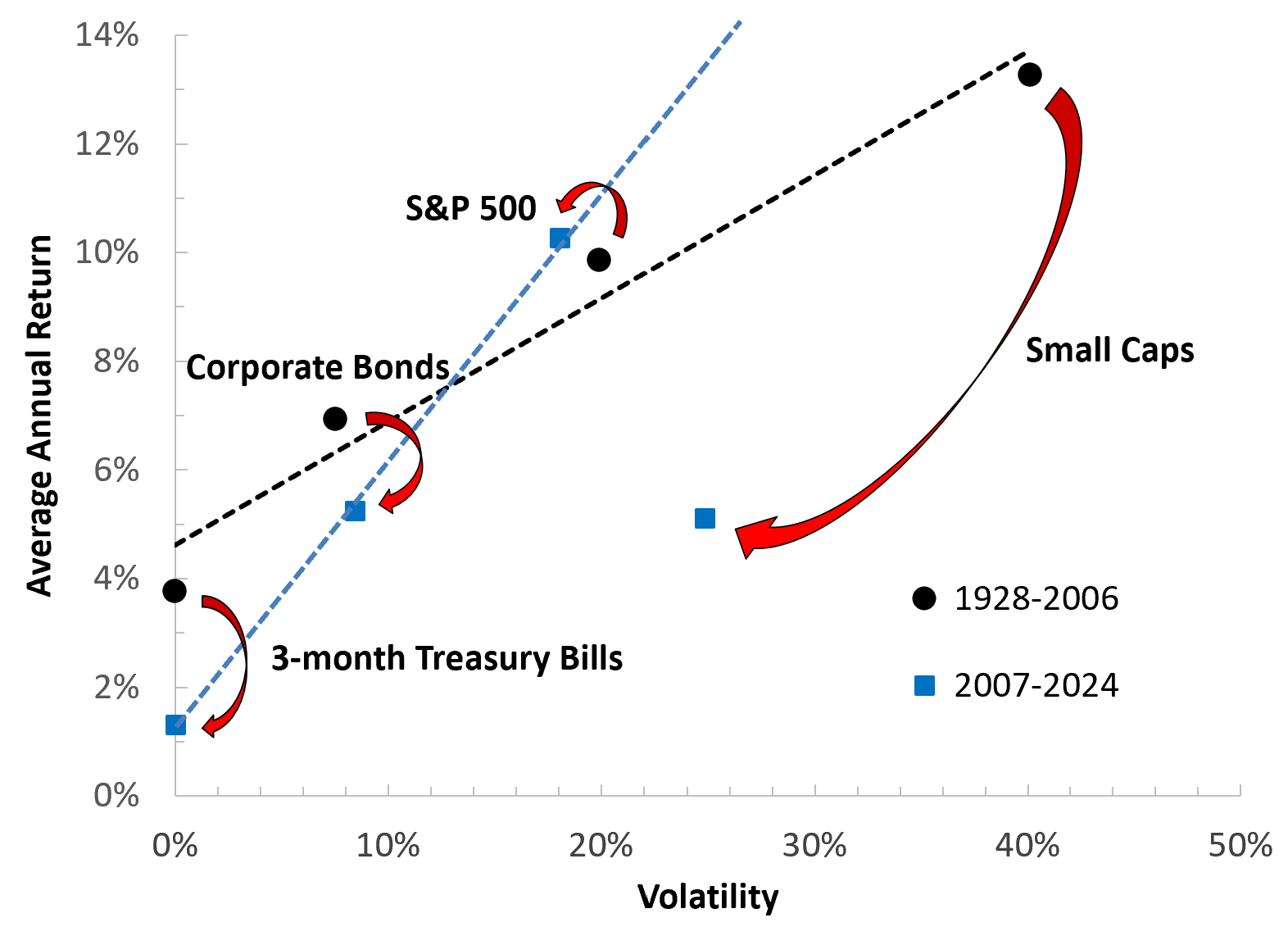
Figure 6 again depicts the average annual return and volatility for each asset class in risk and return space. The volatility of small cap stocks did indeed decline meaningfully during the post-2006 period, which in most cases would be considered an improvement, but their returns fell proportionately more. In fact, the average annual return on small caps from 2007 to 2024 was not only significantly lower than the average return on the S&P 500 over this same period, it was lower than the average return on corporate bonds, despite exposing investors to nearly triple the risk.
As a result, the nearly linear relationship between risk and return that characterized the 1928-2006 period simply vanished. Small caps now sit well below even a naive mean-variance frontier constructed from major U.S. asset classes and thus no longer appear to offer a compelling risk-return trade-off.4
Why This Time Is Different
Figures 5 and 6 paint a dismal picture for small caps stocks. The small cap premium has turned negative and shows no signs of recovering and, as a result, small cap stocks as an asset class look far less attractive to the long term investor than the S&P 500.
To understand why this likely isn't just a temporary blip, let's consider how the structure of small firms and the broader economy has changed. Two developments in particular stand out, and together they provide a coherent explanation for the post‑2006 regime shift.
(1) A Lower Quality Small Cap Universe
The quality of small caps has deteriorated over time. The bottom decile of stocks when ordered by market cap now contains a growing share of unprofitable firms, low‑return businesses, and so‑called “zombie” companies.
Academic research supports this view. Fama and French (2015) show that profitability and investment factors explain a large portion of the cross section of returns, and firms with weak fundamentals tend to earn persistently low returns.
Asness, Frazzini, and Pedersen (2019) further document that low‑quality firms underperform systematically, with the effect especially pronounced among smaller companies.
Reinforcing the importance of firm quality, methodology papers from S&P Dow Jones show that the S&P 600’s profitability screen produces substantially better long‑term results than simply investing in the bottom decile by market cap.5 Indeed, between 2007 and 2024, the average annual return for the S&P 600 was a respectable 8.7 percent versus just 5.1 percent for the bottom decile by market cap, a striking difference given that both indexes target the same segment of the market.6
A key factor driving the deterioration in small cap quality is the well-documented decline in IPO activity. Gao, Ritter, and Zhu (2013) show that this decline reflects a structural shift in the economics of going public. High‑growth firms increasingly choose to remain private longer because scale advantages, network effects, and abundant private capital make it attractive to delay an IPO.
As a result, many promising young firms now enter the public markets only after reaching mid‑cap or large‑cap size. For example, Rivian, Coinbase, Snowflake, Airbnb, DoorDash, Robinhood, Arm, Uber, Lyft, Zoom, Spotify, Datadog, and Palantir all entered the public markets at valuations ranging from roughly ten billion dollars to well over fifty billion dollars. The result of companies waiting longer to make an IPO is a weaker pipeline of newly public small cap firms.
(2) Large Cap Dominance in a Winner-take-most Economy
The modern economy increasingly rewards scale, data, and intangible capital. Industries such as cloud computing, search, digital advertising, semiconductors, and artificial intelligence exhibit powerful network effects and large fixed‑cost advantages. These industries reward being big, sometimes astonishingly so. As a result, large cap firms benefit disproportionately.
Small caps, on the other hand, operate more heavily in sectors without these advantages, including regional banking, local services, consumer discretionary products, and industrials.
This structural shift was not present for most of the 1928 through 2006 period. Evidence from Autor et al. (2020) shows that a small number of highly productive superstar firms have increasingly captured a disproportionate share of industry sales, profits, and market power.
Related work by De Loecker, Eeckhout, and Unger (2020) documents a broad rise in markups and market concentration, with the largest firms capturing an increasing share of economic surplus.
Together, these findings support the view that the modern economy structurally channels economic gains toward large firms, which helps explain why large caps have strengthened and small caps have weakened.
So Are Small Caps Actually Dead?
The small cap premium we discuss in lecture, and that appears so cleanly in nearly a century of historical data, was never guaranteed to persist unchanged. It emerged in an economic environment where small, profitable, capital intensive firms could grow quickly, go public early, and challenge incumbents. In that world, the small cap universe was replenished each year with new, dynamic firms that helped sustain strong long run returns.
That world has changed. Today’s economy increasingly rewards scale, data, and intangible capital. At the same time, high growth firms now remain private far longer, often reaching mid cap or large cap size before entering public markets. The combination of a weaker IPO pipeline and an economy that disproportionately channels gains to dominant firms has reshaped the opportunity set for the long term investor.
Small caps are not dead, but the world that once powered a broad and persistent small cap premium is gone, and investing as if it still exists means ignoring the reality of the modern economy.
If you enjoyed this mildly efficient and occasionally rational look at why small cap stocks have underperformed in recent years, consider subscribing below. We’ll keep exploring markets and models, uncovering mildly surprising truths.
No hot takes; just thoughtful ones.

About the Author: Seth Neumuller is an Associate Professor of Economics at Wellesley College where he teaches and conducts research in macroeconomics and finance. He holds a Ph.D. in economics from UCLA. His Substack is Mildly Efficient (and Occasionally Rational) where he explores topics in finance and macro from first principles, cutting through complexity with clear, grounded analysis.
Notes and Sources
AI tools were used to edit prose; all figures are straightforward to reproduce from the cited sources.
Throughout this piece, and consistent with the Damodaran data used in the analysis, small caps are defined as the bottom decile of the CRSP universe, meaning the smallest 10 percent of NYSE, AMEX, and Nasdaq firms ranked by market capitalization. This CRSP decile approach is standard in academic finance because it provides a consistent, rules‑based definition of firm size across time and avoids the distortions created by index reconstitutions or arbitrary market‑cap breakpoints.
More precisely, assets on the capital allocation line have the same Sharpe ratio, which is defined as the expected excess return of an asset (above a risk-free Treasury) divided by the assets volatility.
If we exclude the depths of the financial crisis, between 2010 and 2024 small caps returned just 8.3 percent per year compared to an astounding 13.8 percent per year for the S&P 500, implying a small cap premium of negative 5.5 percent.
While Figure 6 is intended as a simple, intuitive comparison rather than a formal portfolio‑optimization exercise, it underscores how dramatically the relationship between risk and return across asset classes shifted.
To be included in the S&P 600 index, small cap firms must have positive GAAP earnings in the most recent quarter and positive GAAP earnings over the trailing 12 months.
Source: https://totalrealreturns.com/n/IJR?start=2007-01-01&end=2025-01-01, accessed December 3, 2025.